Twitter’s Broken Promise: When Accessibility Settings Leave You Squinting 😣
Let’s be real. We’ve all fallen down a Twitter rabbit hole, thumb scrolling endlessly through hot takes, cat videos, and the occasional existential crisis. It’s my go-to app for a quick hit of what’s happening in the world. But recently, my experience has been… well, frustrating. And it’s not just the algorithm changes.
I have a minor visual impairment. Nothing major, but on days when my eyes are tired, high contrast modes and larger text are my digital lifelines. So, when Twitter rebranded to X and started pushing out updates, I was optimistic. Maybe they’d finally nail the accessibility features!

Spoiler alert: 🚨 They didn’t.
I’ve clicked that “enable high contrast” button more times than I’ve refreshed my feed hoping for a celebrity feud resolution. It feels like a digital doorbell that doesn’t ring—you press it, but nothing happens. And I know I’m not alone. Across forums and social media, users are reporting that key accessibility settings, particularly for contrast, fonts, and readability, are glitchy, unreliable, or simply don’t work.
This isn’t just a minor bug. It’s a significant barrier that slams the door shut for many users who rely on these features to participate in the public conversation.
The Core of the Problem: Where X is Falling Short
So, what’s actually breaking? Let’s break it down.
🎨 The High Contrast Mode That’s Anything But
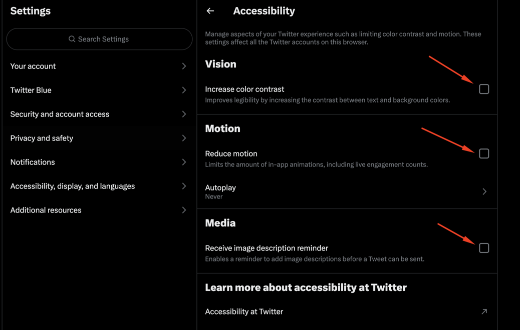
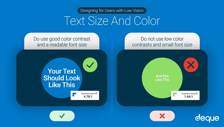
The high contrast mode is designed to make text stand out sharply against its background, which is a game-changer for users with low vision, cataracts, or certain light sensitivities. According to Twitter’s own help documentation, enabling it should transform the interface.
In reality? It’s a coin toss. Sometimes it works partially, turning the background a dark blue instead of black but leaving buttons and text the same. Other times, toggling the setting does absolutely nothing. It’s like having a remote control where the volume button only works on Tuesdays. This inconsistency makes the platform unusable for many who depend on this feature.
🔠 Font Size Follies: When Bigger Isn’t Better
Then there’s the font size setting. You go into your settings, bravely slide the selector to “Larger” or even “Largest,” hit save, and… poof. The app refreshes, and the text is stubbornly the same size. Or, my personal favorite: some text gets bigger (like tweets), but all the crucial navigation labels, buttons, and menu text stay microscopic.
This isn’t just an annoyance. The World Health Organization estimates that over 2.2 billion people globally have a near or distance vision impairment. For them, customizable text isn’t a convenience; it’s a necessity. When these settings fail, X isn’t just glitchy—it’s exclusionary.
Why This Matters More Than You Think
This goes beyond a few frustrated users. It’s about principle and precedent.
Accessibility isn’t a niche problem. It’s a fundamental aspect of good design that benefits everyone. Ever tried to read your phone in bright sunlight? A strong contrast mode would help. Feeling eye strain after a long day? Larger fonts would reduce the fatigue.
Furthermore, in many regions, digital accessibility is a legal requirement, not a suggestion. Laws like the Americans with Disabilities Act (ADA) and the European Accessibility Act mandate that digital platforms be accessible to people with disabilities. By having broken accessibility features, X isn’t just failing its users; it’s potentially opening itself up to legal challenges. It signals that for all its talk of being the “everything app,” the basic needs of a significant portion of its user base are being deprioritized.
A Tale of Two Feeds: X vs. The Competitors
Let’s put this into perspective. While X is struggling with its basic settings, other platforms have largely figured this out.
| Feature | X (Twitter) | Competitors (e.g., Instagram, Facebook) |
|---|---|---|
| High Contrast Mode | Unreliable; often doesn’t activate | Reliable system-level integration |
| Custom Font Size | Inconsistent; rarely applies app-wide | Consistently scales all text elements |
| Readability | Poor without reliable settings | Better with consistent zoom and text options |
| User Experience | Frustrating and exclusionary | Generally predictable and accessible |
This comparison isn’t to bash X unnecessarily. It’s to show that this is a solved problem in many other apps. The technology and know-how exist; it’s a matter of prioritization.
What You Can Do: Workarounds & Raising Your Voice
While we wait for (hopefully) a fix from X, here are a few things you can try:

-
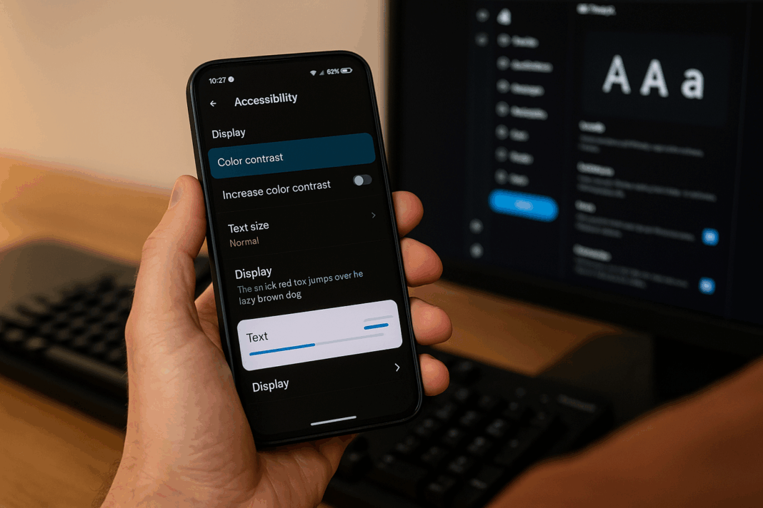
Leverage Your Device’s Settings: Don’t rely on the in-app options. Use your phone’s system-wide accessibility features. On iOS, check out Display & Text Size settings. On Android, explore the Text and display options. These often override app inconsistencies and provide a more reliable experience.
-
Use a Third-Party App: Some third-party Twitter clients still in operation often pay closer attention to design and accessibility details. Explore your options!
-
Report the Bug! This is the most important step. Don’t just get frustrated and close the app. Use the “Help and feedback” section in your settings to report the issue. The more people who officially report that contrast and font settings are broken, the higher it will rise on their internal priority list.
-
Speak Up Publicly: Tweet about it! Use your platform (ironically) to call out the issue. Tagging @X and @XSupport can get attention, especially if a tweet gains traction.
The Bottom Line: Accessibility is Non-Negotiable
In the end, this isn’t about a few misplaced lines of code. It’s about empathy. It’s about building a platform that truly is for everyone. Every time an accessibility feature fails, it tells a segment of the population, “You are not important here.”
X has the resources and the talent to fix this. They’ve engineered complex algorithms and sprawling server infrastructures; making a high contrast mode function reliably is well within their capabilities. It’s a matter of making it a priority.

I love the chaos, the news, and the community on X. But until they fix these fundamental issues, my experience—and the experience of millions of others—will remain deeply flawed. Here’s hoping they start listening. 👂
What about you? Have you struggled with X’s accessibility settings? What workarounds have you found? Share your story in the replies below—let’s get this conversation trending! 💬
You should also read these…
- noepic.com – game launch errors on pc driver update guide
- sixrep.com – how to build a community around your product
- axtly.com – budget friendly ring light setups for beginners
- tugmen.com – tiktok not working with vpn alternative fixes
- axtly.com – content and copyright issues and solving methods o
- spyfrogs.com – inside the making of 2025s blockbuster hits
- tugmen.com – tiktok not available in your country error
- beofme.com – errors in tiktok content planning
- olddry.com – epic games error code ls 0013 game not launching
- surgeblog.com – unable to update phone number on tiktok


